Umbre CRM
Designing a Scalable CRM System for Modern Sales Team
My Role
Design System, Product UX, Developer Handoff,
Tools
Figma Claude Mermaid (Diagramming)
Timeline
June 2025
Description
How do you transform the complexity of customer relationship management, with its vast amounts of data, intricate workflows, and multi-user needs, into an interface so intuitive that it feels effortless?
Context
Umbre is a comprehensive Customer Relationship Management platform designed for small to medium-sized businesses. It focuses on simplicity without sacrificing powerful features, making CRM accessible to teams of all technical levels.

Overview & Context
This project focused on designing a modular, scalable CRM solution that supports sales, relationship management, reporting, and workflow tracking across multiple views (dashboard, tables, cards, kanban, calendar).
The goal was not just to design screens, but to create a cohesive design system that enables:
Fast feature expansion
Consistent UX across complex data views
Efficient developer handoff
Long-term product scalability
Problem | Solution | Target Users |
|---|---|---|
|
|
|
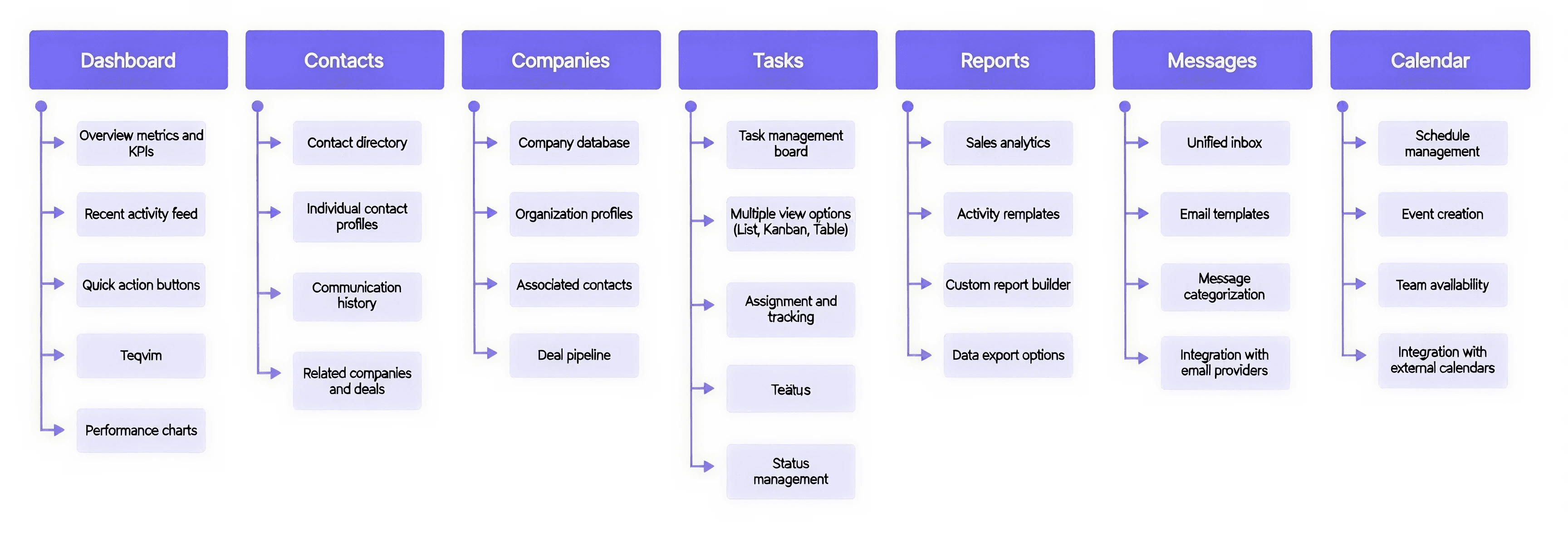
Information Architecture-
The platform is organized into 7 primary modules, each designed for specific workflows.
User Flow
Primary User Journey: From Login to Task Completion
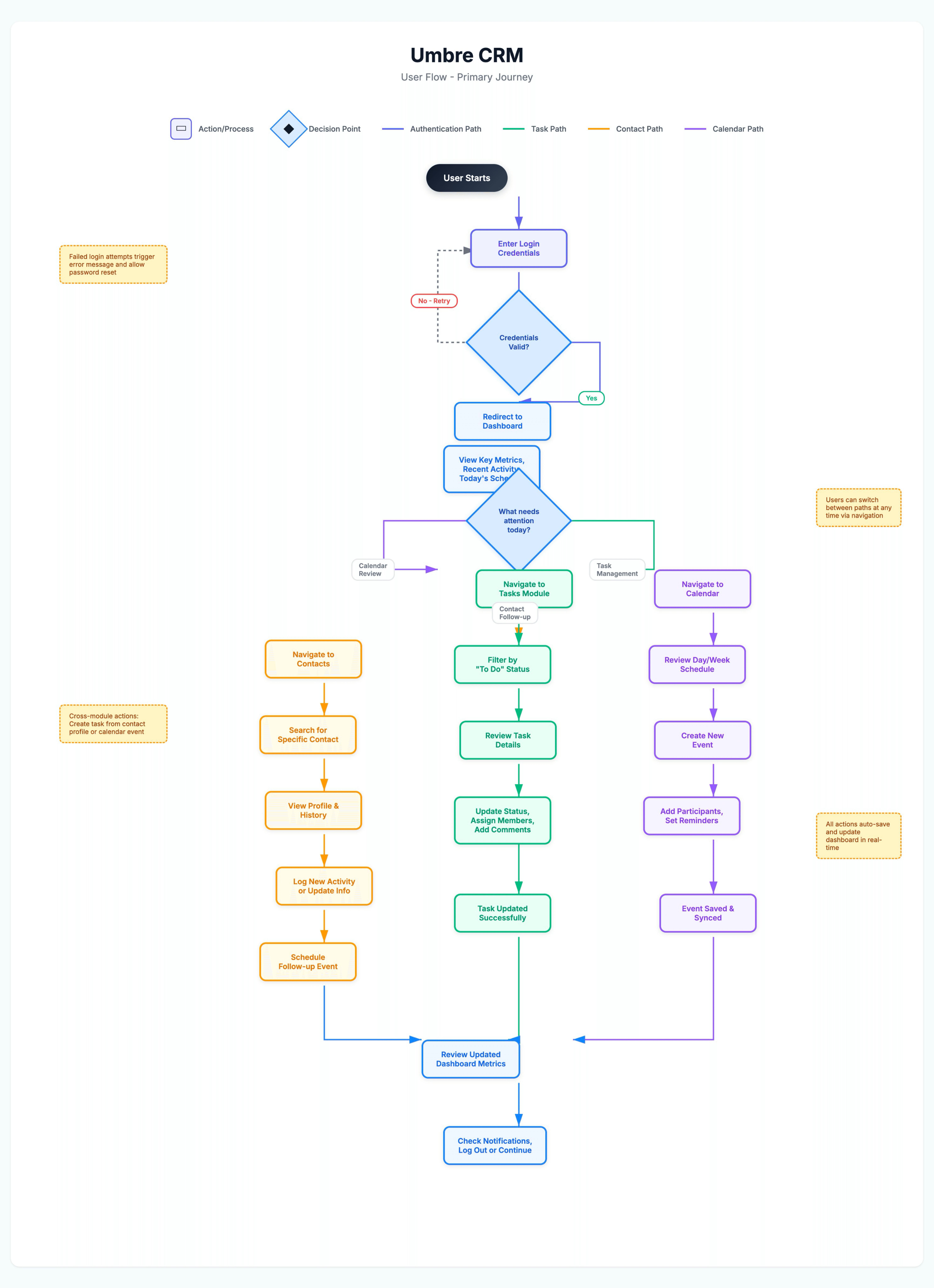
Userflow chart v1
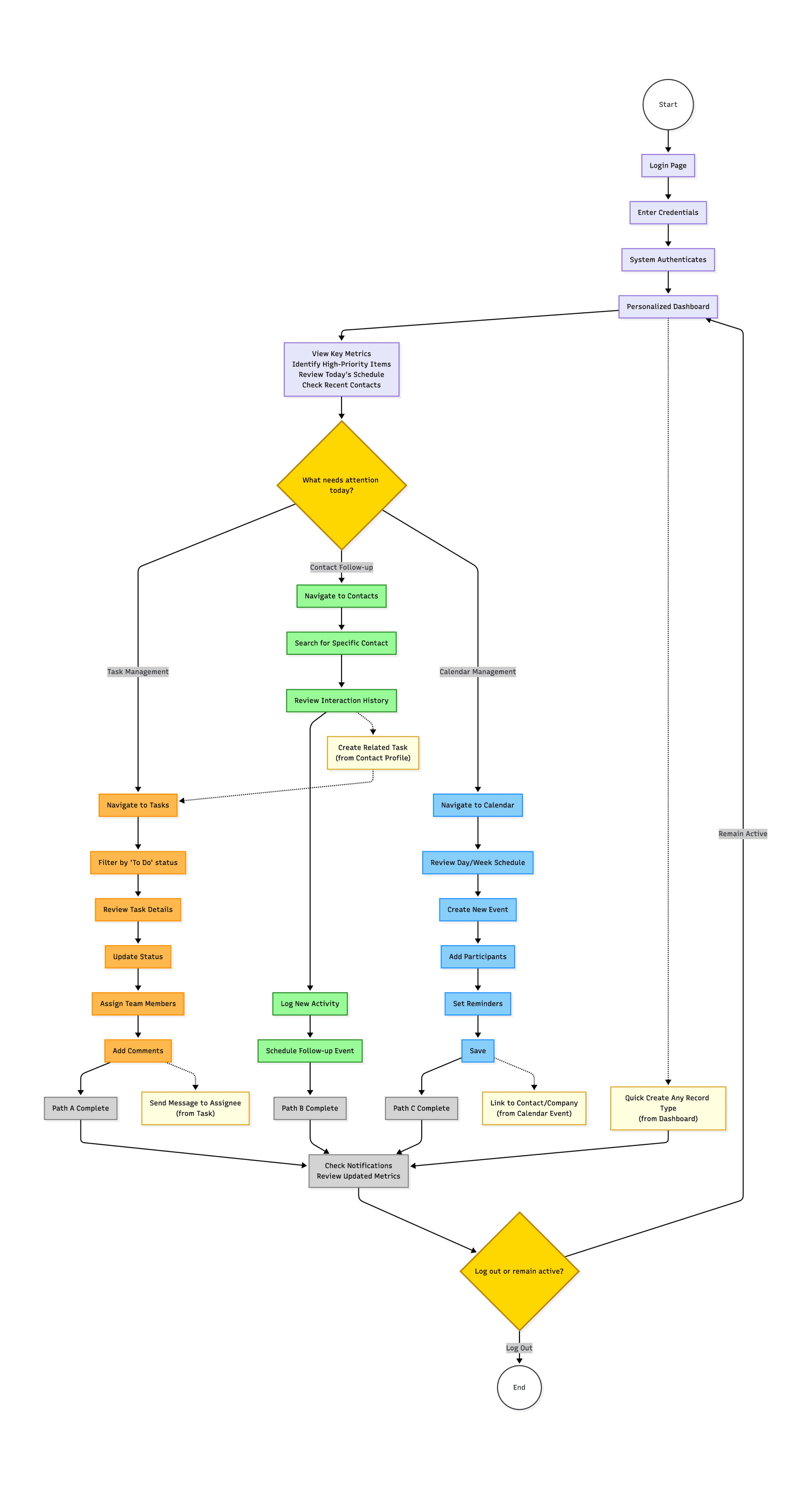
Userflow chart v2
Hi-fi Wireframe and Prototype
High-fidelity wireframes introduced visual design elements while maintaining structural decisions from low-fi phase.
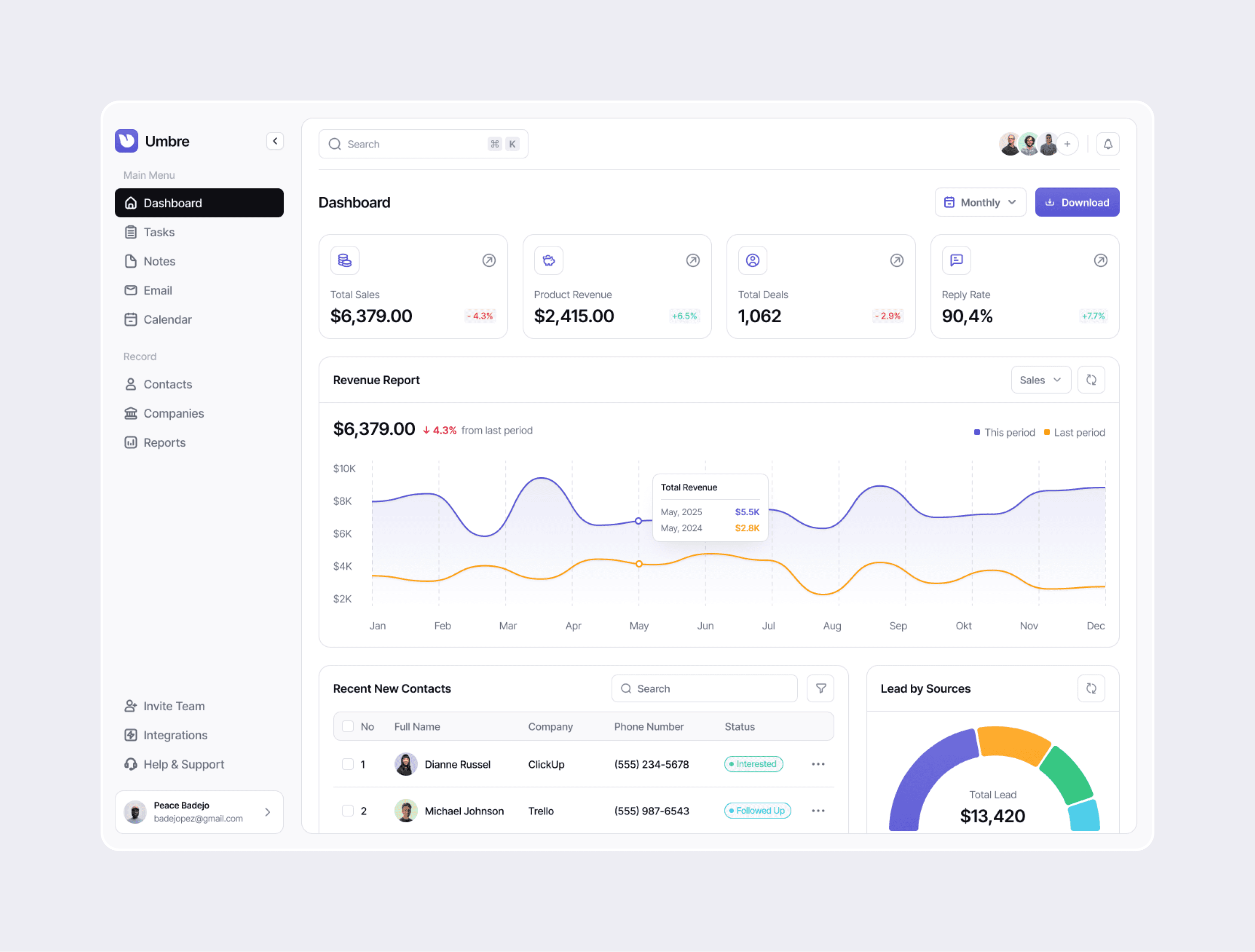
Dashboard:
Metric cards with color-coded trend indicators
Interactive revenue chart with period comparison
Recent contacts table with status badges
Lead sources pie chart with drill-down capability
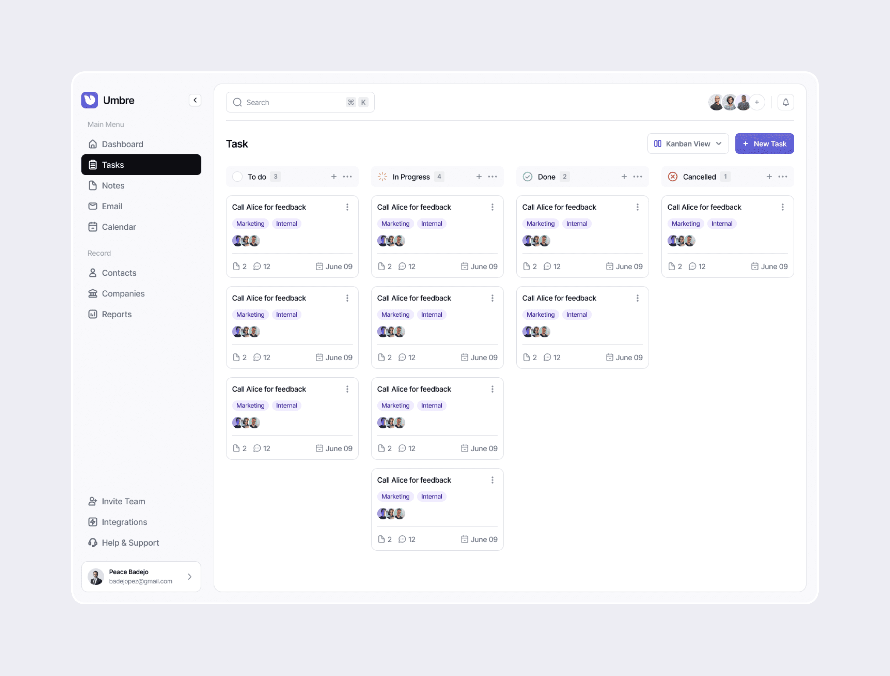
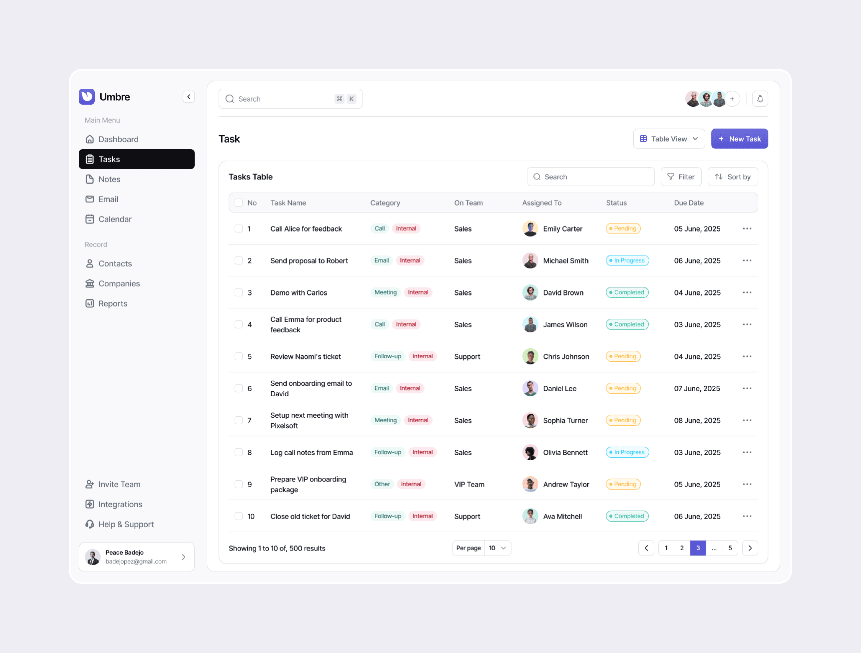
Task Management:
View switcher (List/Kanban/Table) in header
Status-based color coding (yellow=pending, blue=in progress, green=done, red=cancelled)
Team member avatars for quick assignment visualization
Category tags for task classification
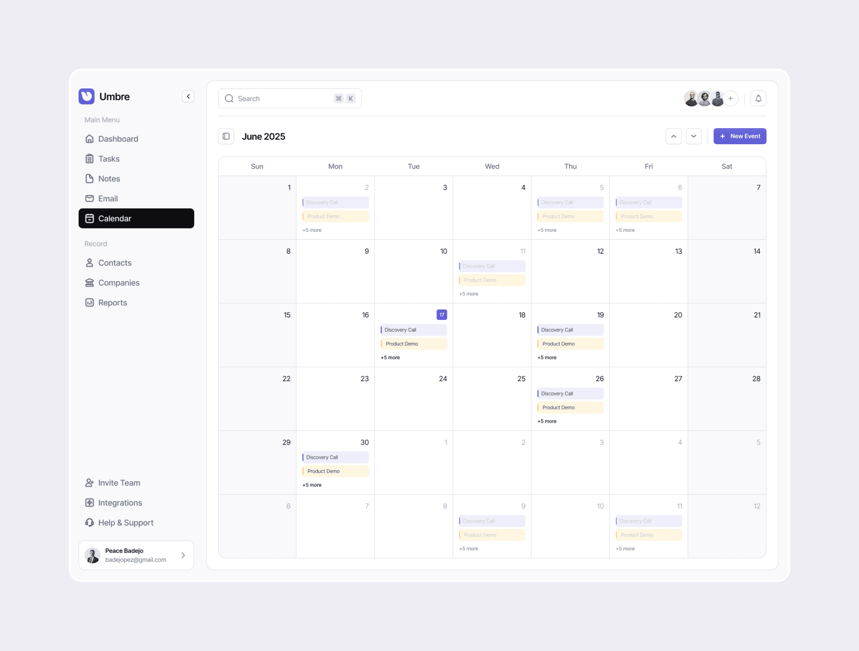
Calendar:
Month/Week/Day view toggle
Color-coded event types
Inline event creation
Time slot availability indicators
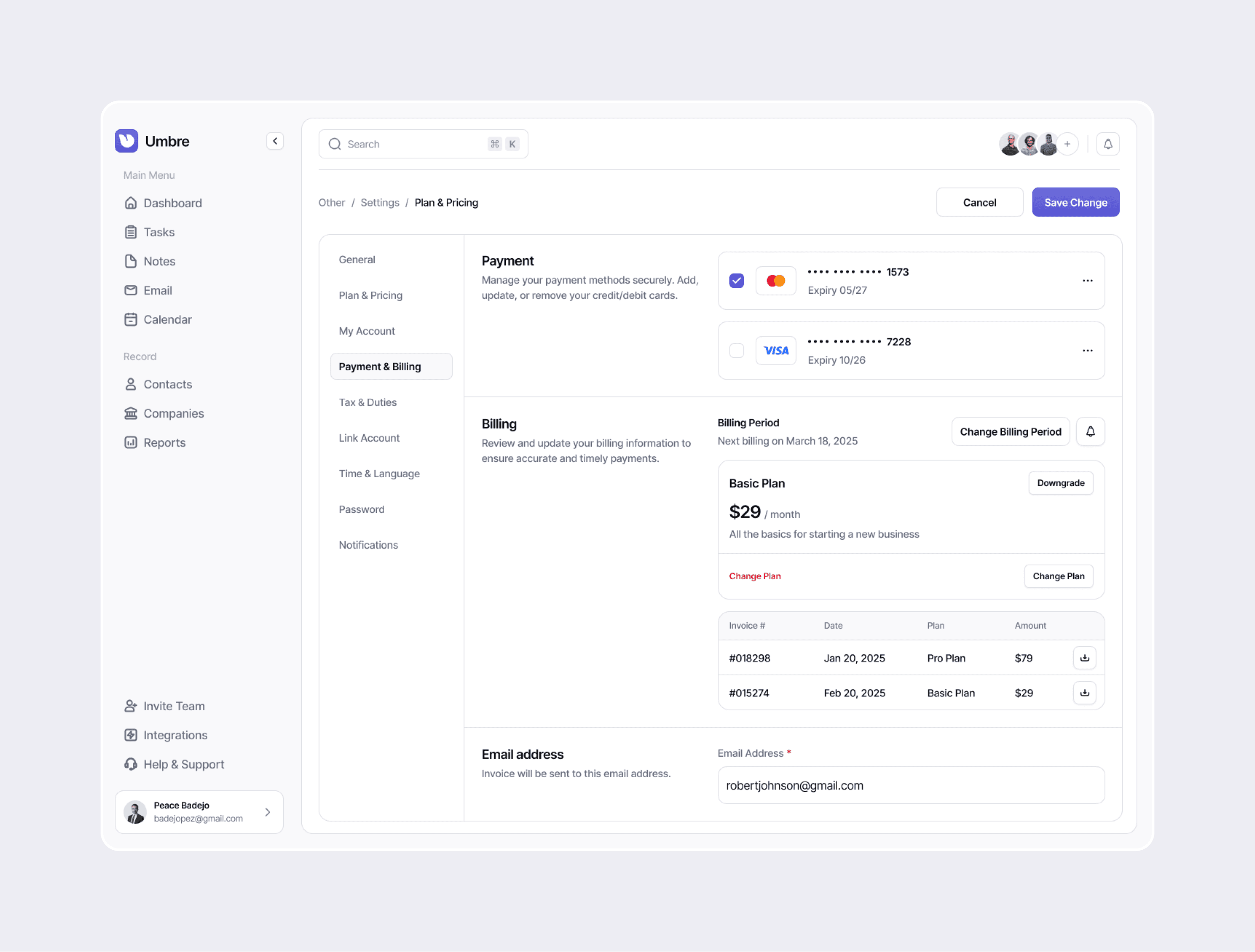
Settings Refinements:
Left sidebar category navigation
Tabbed content organization
Form layouts with clear field grouping
Action buttons positioned consistently (Cancel/Save)
Colour & Typography
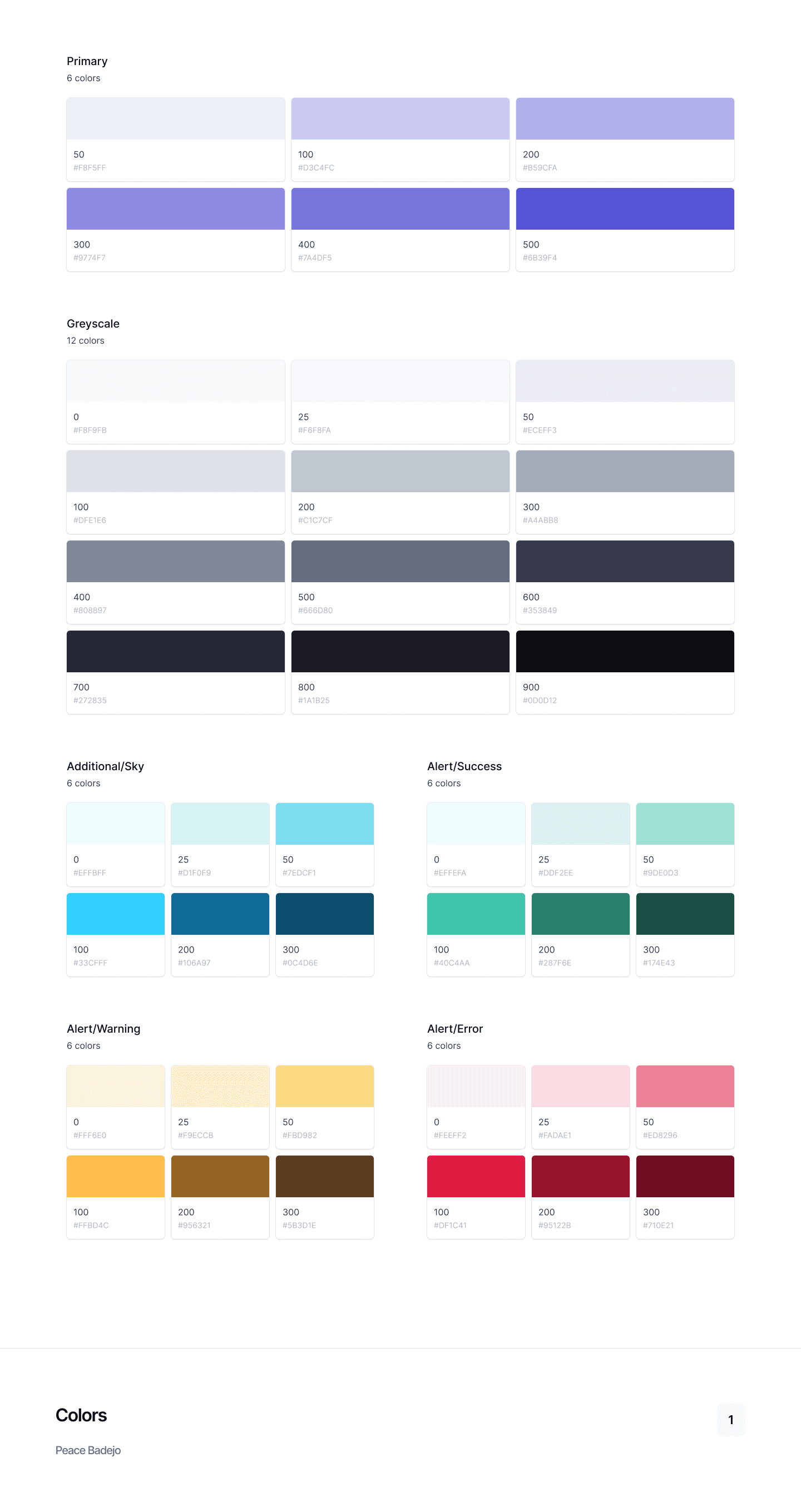
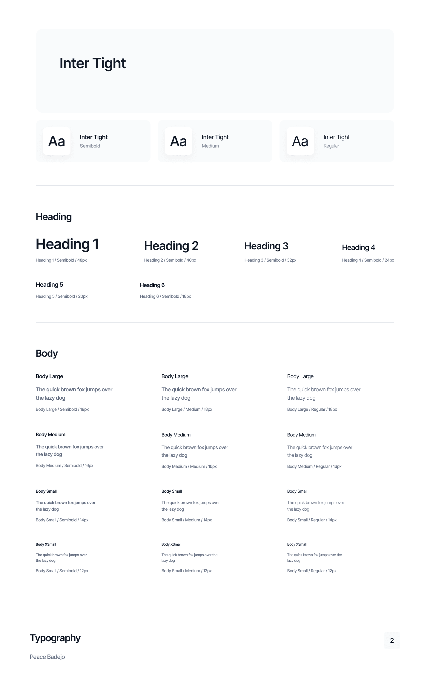
The color and typography system embodies a core principle: accessibility is not a constraint, it's a catalyst for better design. By prioritizing contrast, hierarchy, and redundant encoding (colour + icon + text), Umbre becomes more usable for everyone.
High contrast benefits users in bright offices. Clear typography helps users working long hours. Semantic color reduces cognitive load for all users, not just those with color blindness.
The system proves that inclusive design and beautiful design are not mutually exclusive—they're complementary forces that elevate the entire user experience.
Colour
Typography
Design System
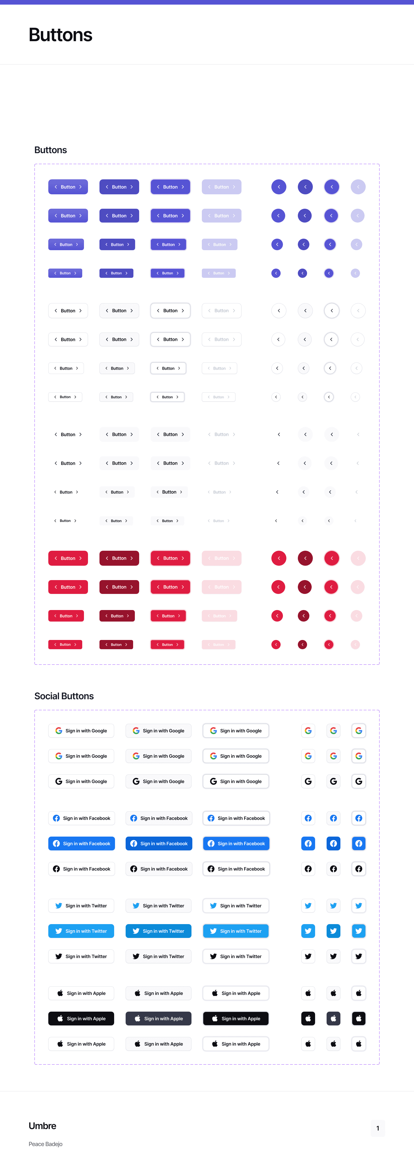
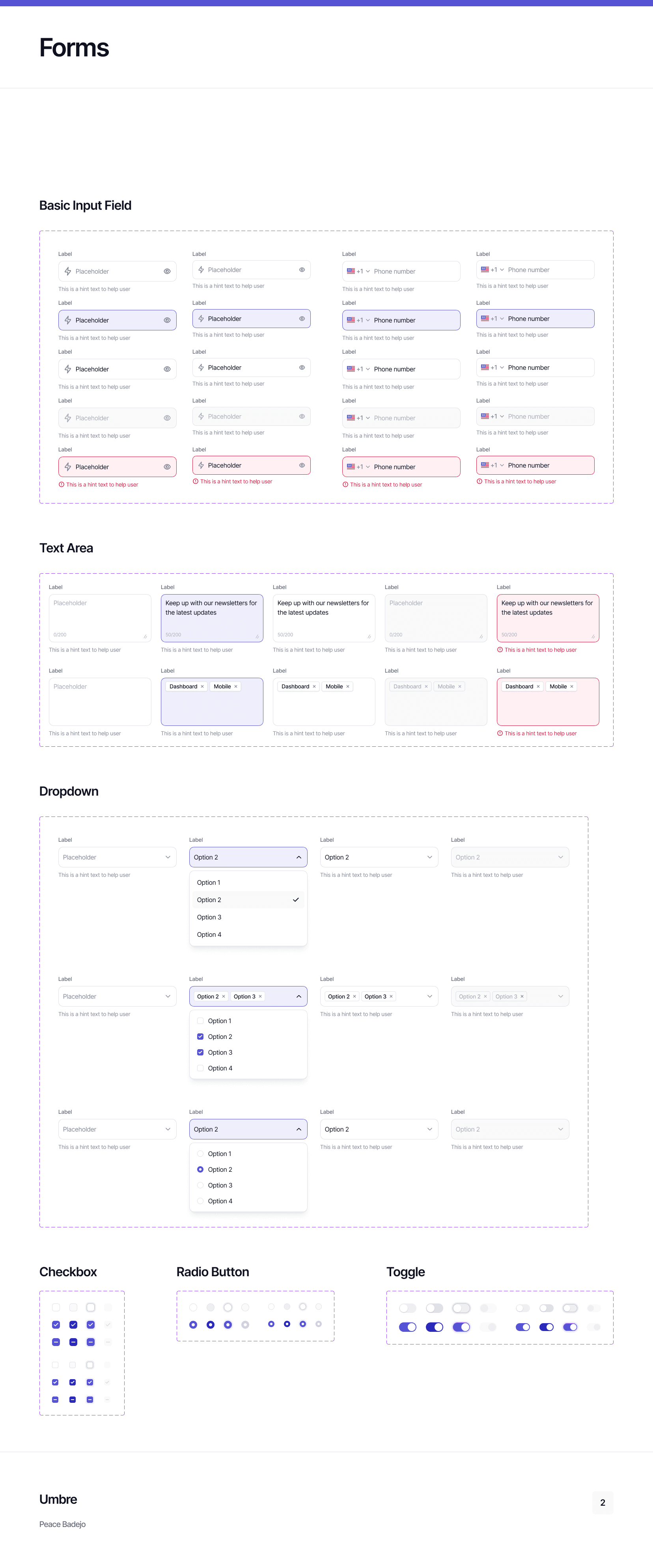
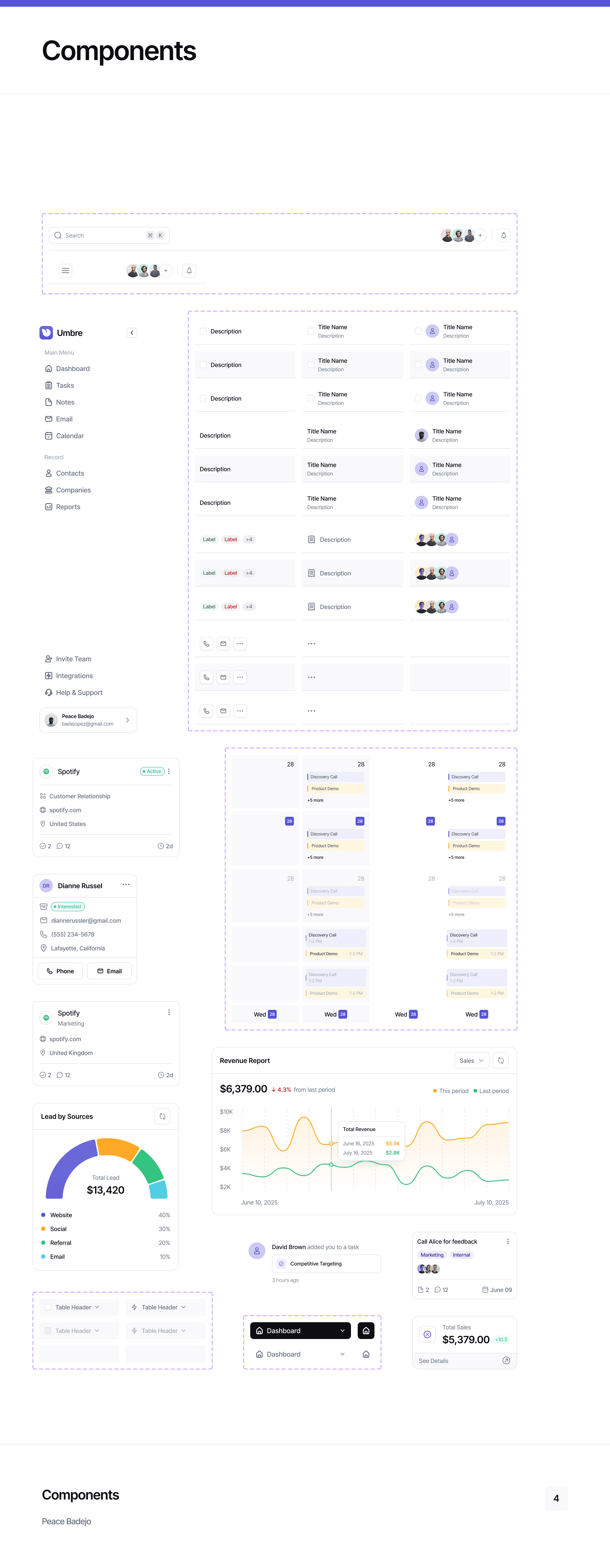
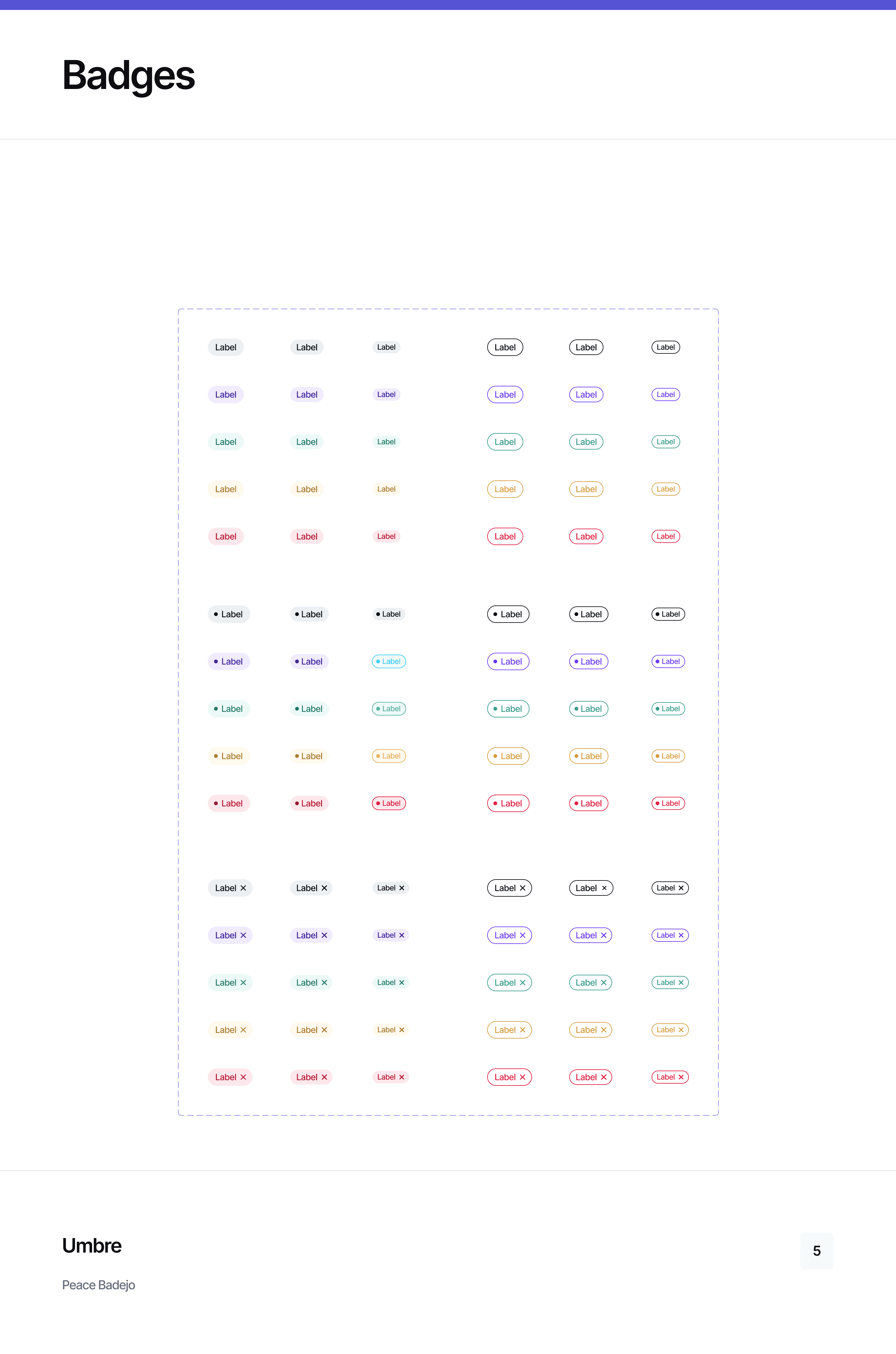
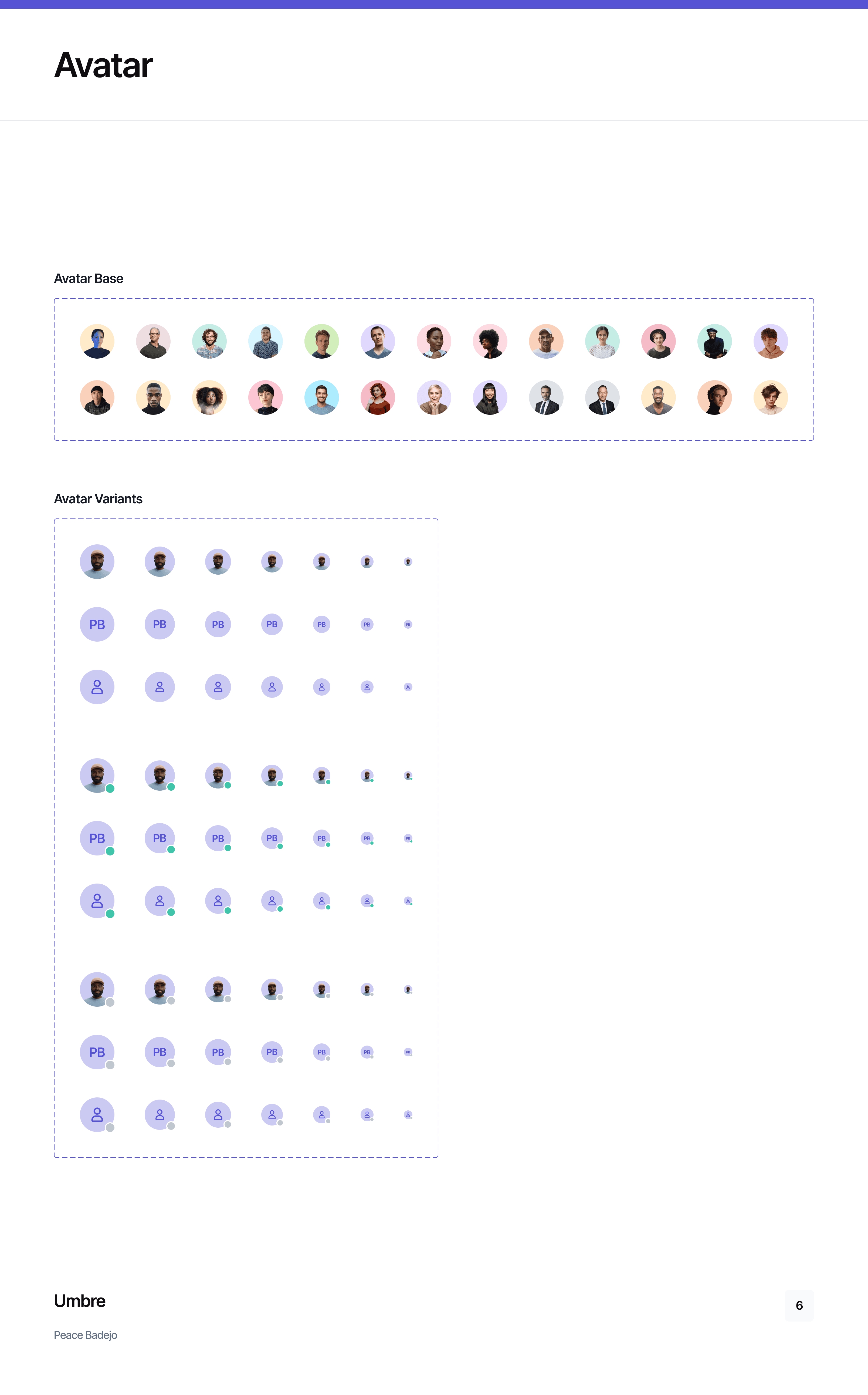
The design system was built around predictable primitives:
Cards
Tables
Status pills
Avatars
Actions
Data visualisation components
Each element works consistently whether it appears in:
Dashboard summaries
Contacts tables
Kanban boards
Grid cards
Reports and analytics

Responsive Design Strategy.
Core Principle:
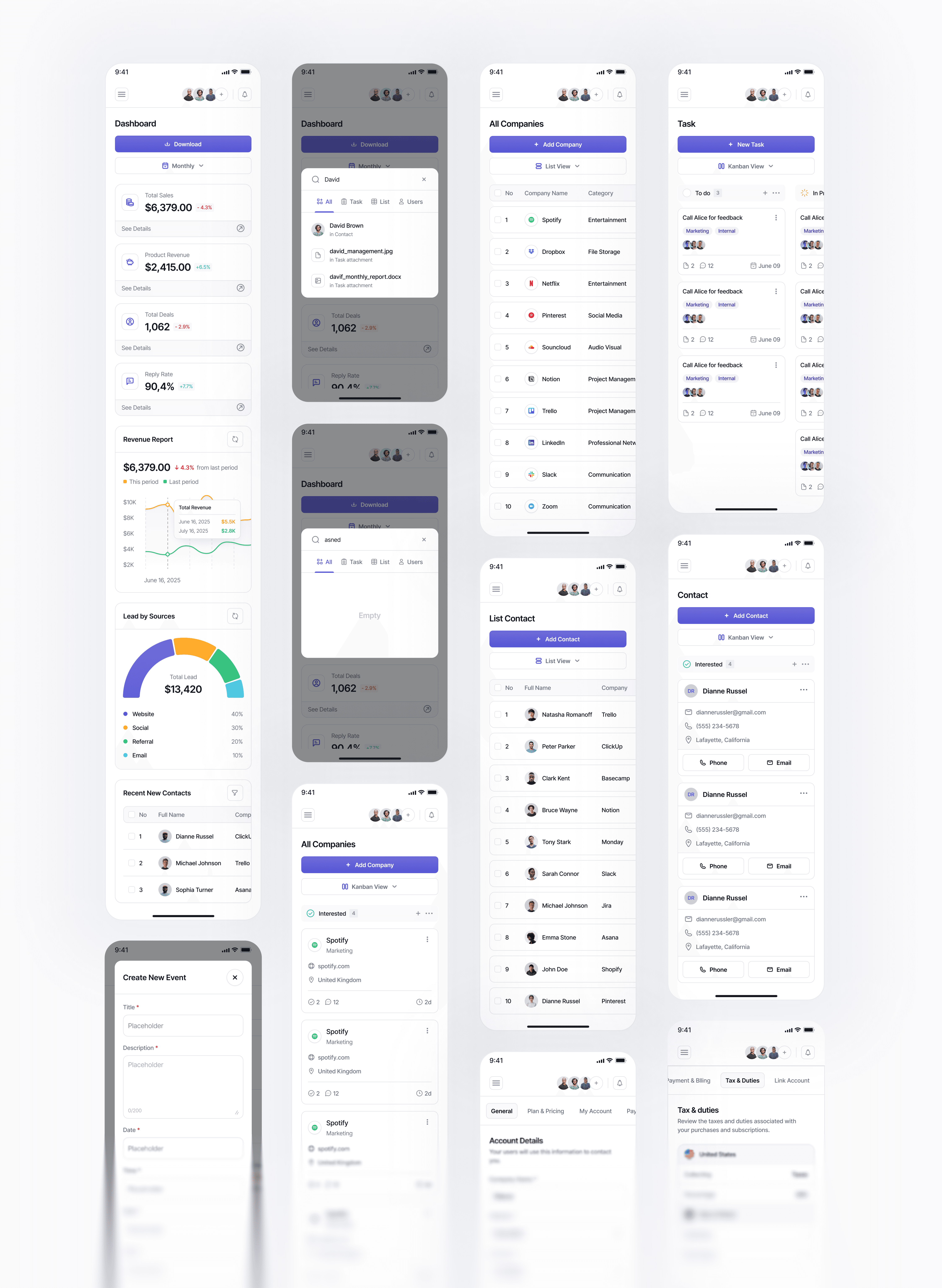
Responsiveness is not about resizing screens — it is about preserving information hierarchy, decision clarity, and task continuity across contexts.
For a CRM, responsive design must ensure that:
Key insights remain immediately visible
Actions remain reachable without friction
Users do not lose context when moving between devices
The system is therefore designed to reflow information, not merely scale UI.
The system was designed with implementation in mind:
Clear component boundaries
Predictable variants instead of bespoke solutions
Tokenised spacing, color, and typography
Data-visualisation patterns aligned with charting libraries
Developer Handoff & Implementation Strategy
Design-to-Code Alignment:
The system was designed with implementation in mind:
Clear component boundaries
Predictable variants instead of bespoke solutions
Tokenised spacing, color, and typography
Data-visualisation patterns aligned with charting libraries
What This Demonstrates
This work demonstrates:
Advanced information design capability
System-level thinking across complex data products
Strong understanding of CRM usage patterns
Ability to design for both users and implementation teams
A design approach that scales with product and organisation growth

